
CSS3边框、背景以及文本效果
边框
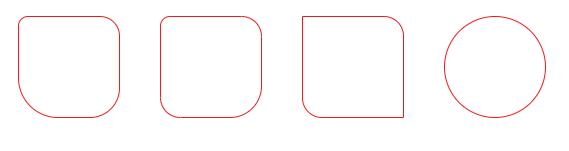
带有弧度的边框
border-radius用于创建圆角边框,它是border-top-left-radius、border-top-right-radius、border-bottom-right-radius和border-bottom-left-radius的简写形式。
注意:当表格元素的border-collapse为collapse时,border-radius无效。
css
.box1 {
-webkit-border-radius: 10px 20px 30px 40px;
border-radius: 10px 20px 30px 40px;
}
.box2 {
-webkit-border-radius:10px 20% 2em;
border-radius: 10px 20% 2em;
}
.box3 {
-webkit-border-top-right-radius: 20px;
border-top-right-radius: 20px;
-webkit-border-bottom-left-radius: 20px;
border-bottom-left-radius: 20px;
}
.box4 {
-webkit-border-radius: 50%;
border-radius: 50%;
}
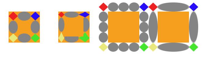
使用图片作为边框
border-image将图片规定为包围元素的边框。是border-image-source、border-image-slice、border-image-width、border-image-outset和border-image-repeat的简写形式。
语法
css
border-image: source slice / width repeat;
border-image: source slice / width / outset repeat;
border-image-source:用于作为边框的图片border-image-slice: 图片边框向内偏移,可以接受1~4个值border-image-width: 图片边框的宽度border-image-outset: 图片区域超出边框的量border-image-repeat: 图片边框是否应平铺(repeat)、铺满(round)或拉伸(stretch)
以下面的图片(90 * 90)作为边框。

css
.box1 {
border-image: url('img/border_30.png') 30 / 30;
}
.box2 {
border-image-source: url('img/border_30.png');
border-image-slice: 30 20 20 30;
border-image-width: 20px;
}
.box3 {
border-image-source: url('img/border_30.png');
border-image-slice: 30;
border-image-width: 30px;
border-image-outset: 30px;
border-image-repeat: round;
}
.box4 {
border-image: url('img/border_30.png') 30 / 30px / 30px stretch;
}
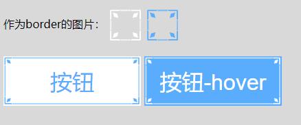
小案例:
css
.btn {
width: 200px;
height: 72px;
font-size: 32px;
outline: none;
}
.btn1 {
border-image: url(img/border_test.png) 40% / 15px;
background-color: #fff;
color: #4eb5fe;
}
.btn-hover {
border-image: url(img/border_test_white.png) 40% / 15px;
background-color: #4eb5fe;
color: #fff;
}
html
<button class="btn btn1">按钮</button>
<button class="btn btn-hover">按钮-hover</button>
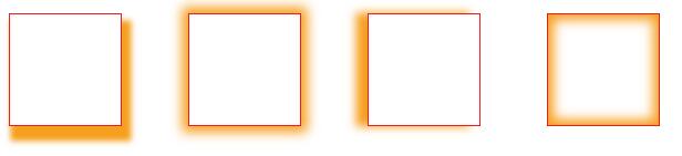
盒子阴影
box-shadow用于添加盒子阴影
语法:
css
box-shadow:h-shadow v-shadow [blur] [spread] [color] [inser/outset];
h-shadow:水平方向的位置v-shadow:垂直方向的位置blur:可选,模糊距离spread:阴影的尺寸color: 阴影的颜色inset/outset:内部阴影或外部阴影(默认为外部outset)
css
.box1 {
box-shadow: 5px 10px 5px 3px orange;
}
.box2 {
box-shadow: 0 0 10px 5px orange;
}
.box3 {
box-shadow: -10px 0 8px orange;
}
.box4 {
box-shadow: 0 0 10px 5px orange inset;
}
背景
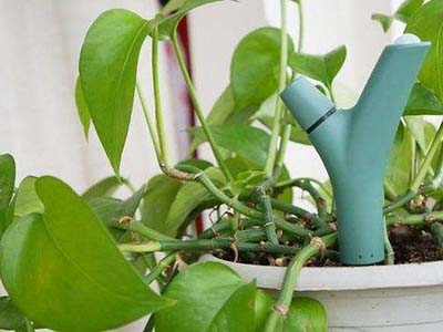
我们下面这张图片(400*300)来测试与背景相关的CSS3属性,
位置
bacgkround-clip规定背景图片放置的位置。
语法:
css
background-clip: border-box | padding-box |content-box;
css
.box {
float: left;
width: 300px;
height: 300px;
margin: 20px;
padding: 20px;
border: 10px dashed #2c2c2c;
line-height: 240px;
font-size: 32px;
font-weight: 700;
text-align: center;
background-image: url(img/background.jpg);
box-sizing: border-box;
}
.box1 {
background-clip: border-box;
}
.box2 {
background-clip: padding-box;
}
.box3 {
background-clip: content-box;
}
.box4 {
-webkit-background-clip: text;
background-clip: text;
color: transparent;
}
定位
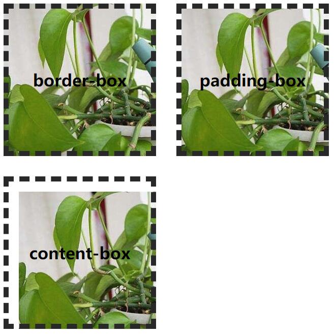
background-origin背景图片相对于某种框来定位
语法:
css
background-origin: border-box | padding-box |content-box;
注意:如果背景图片的background-attachment为fixed无效
css
.box1 {
background-repeat: no-repeat;
background-origin: border-box;
}
.box2 {
background-repeat: no-repeat;
background-origin: padding-box;
}
.box3 {
background-repeat: no-repeat;
background-origin: content-box;
}
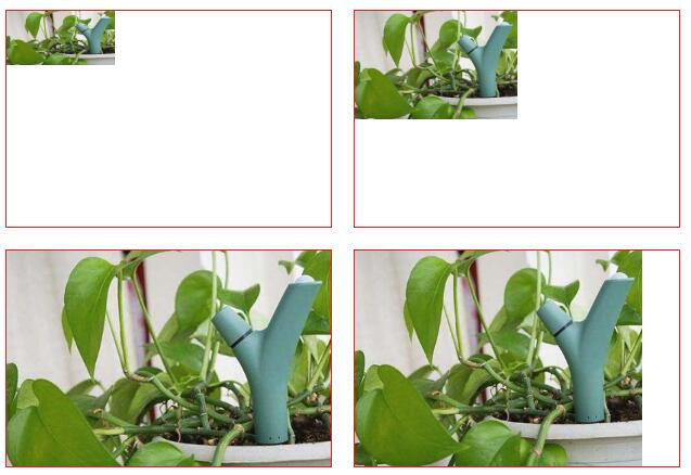
尺寸
backgorund-size指定背景图片的尺寸
语法:
css
background-size: 长度值 | 百分比 | cover | contain;
- 长度值:设置背景图片的宽度和高度,如果只设置一个值,则第二个值会被设置为auto;
- 百分比:相对父级元素的宽度和高度的百分比值,如果只设置一个值,则第二个值会被设置为auto;
- cover: 缩放背景图片以完全覆盖背景区,可能背景图片部分看不见。和contain值相反,cover值尽可能大的缩放背景图像并保持图像的宽高比例(图像不会被压扁)。
- contain: 缩放背景图片以完全装入背景区,可能背景区部分空白。contain 尽可能的缩放背景并保持图像的宽高比例(图像不会被压缩)。
css
.box {
float: left;
width: 600px;
height: 400px;
margin: 20px;
border: 1px solid red;
background-image: url(img/background.jpg);
background-repeat: no-repeat;
}
.box1 {
background-size: 200px 100px;
}
.box2 {
background-size: 50% 50%;
}
.box3 {
background-size: cover;
}
.box4 {
background-size: contain;
}
文本效果
溢出
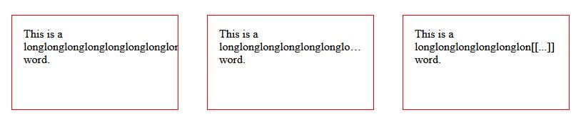
text-overflow:规定当文本溢出时的操作
这个属性只对那些在块级元素溢出的内容有效,但是必须要与块级元素内联(inline)方向一致(举个反例:内容在盒子的下方溢出。此时就不会生效)。文本可能在以下情况下溢出:当其因为某种原因而无法换行(例子:设置了"white-space:nowrap"),或者一个单词因为太长而不能合理地被安置(fit)。
语法:
css
text-overflow: clip | ellipsis | string;
- clip:对溢出的文本进行截断
- ellipsis:对文本进行截断,且添加省略号(…)
- string:
string用来表示被截断的文本。字符串内容将被添加在内容区域中,所以会减少显示出的文本。如果空间太小到连省略号都容纳不下,那么这个字符串也会被截断。
css
.box {
float: left;
width: 200px;
height: 100px;
margin: 20px;
padding: 1em;
border: 1px solid red;
background-repeat: no-repeat;
overflow: hidden;
}
.box1 {
text-overflow: clip;
}
.box2 {
text-overflow: ellipsis;
}
.box3 {
text-overflow: "[[...]]";
}
阴影
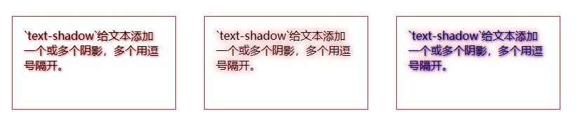
text-shadow给文本添加一个或多个阴影,多个用逗号隔开。
语法:
css
text-shadow: h-shadow v-shadow blur color;
- h-shadow:水平方向位置
- v-shadow:垂直方向位置
- blur:可选,模糊距离
- color:可选,阴影颜色
css
.box1 {
text-shadow: 1px 1px 3px red;
}
.box2 {
text-shadow: 0 0 10px red;
}
.box3 {
text-shadow: 1px 1px 3px blue, 0 0 10px red;
}
断字
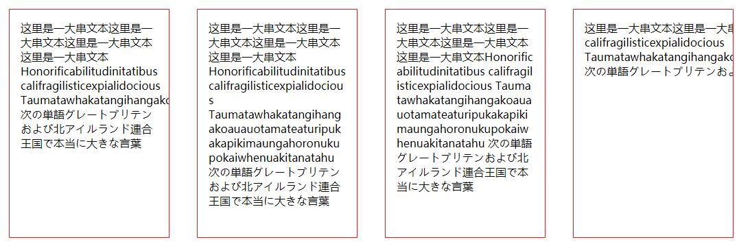
word-break在适当的断字点进行换行。
语法:
css
word-break: normal | break-word | break-all | keep-all;
- normal: 使用浏览器的换行规则
- break-word: 单词结尾处换行
- break-all: 允许在任何地方换行。
- keep-all: 只能在半角空格或连字符处换行。
css
.box {
float: left;
width: 200px;
height: 300px;
margin: 20px;
padding: 1em;
border: 1px solid red;
background-repeat: no-repeat;
overflow: hidden;
}
.box1 {
word-break: normal;
}
.box2 {
word-break: break-word;
}
.box3 {
word-break: break-all;
}
.box4 {
word-break: keep-all;
}
html
<div class="box box1">
这里是一大串文本这里是一大串文本这里是一大串文本这里是一大串文本Honorificabilitudinitatibus califragilisticexpialidocious Taumatawhakatangihangakoauauotamateaturipukakapikimaungahoronukupokaiwhenuakitanatahu 次の単語グレートブリテンおよび北アイルランド連合王国で本当に大きな言葉
</div>
<div class="box box2">
这里是一大串文本这里是一大串文本这里是一大串文本这里是一大串文本Honorificabilitudinitatibus califragilisticexpialidocious Taumatawhakatangihangakoauauotamateaturipukakapikimaungahoronukupokaiwhenuakitanatahu 次の単語グレートブリテンおよび北アイルランド連合王国で本当に大きな言葉
</div>
<div class="box box3">
这里是一大串文本这里是一大串文本这里是一大串文本这里是一大串文本Honorificabilitudinitatibus califragilisticexpialidocious Taumatawhakatangihangakoauauotamateaturipukakapikimaungahoronukupokaiwhenuakitanatahu 次の単語グレートブリテンおよび北アイルランド連合王国で本当に大きな言葉
</div>
<div class="box box4">
这里是一大串文本这里是一大串文本这里是一大串文本这里是一大串文本Honorificabilitudinitatibus califragilisticexpialidocious Taumatawhakatangihangakoauauotamateaturipukakapikimaungahoronukupokaiwhenuakitanatahu 次の単語グレートブリテンおよび北アイルランド連合王国で本当に大きな言葉
</div>
单词换行
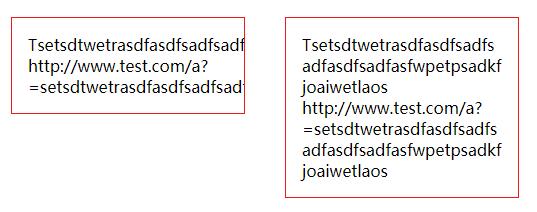
overflow-wrap是用来说明当一个不能被分开的字符串太长而不能填充其包裹盒时,为防止其溢出,浏览器是否允许这样的单词中断换行。
注:word-wrap属性原本属于微软的一个私有属性,在 CSS3现在的文本规范草案中已经被重名为overflow-wrap。word-wrap现在被当作 overflow-wrap的 “别名”。稳定的谷歌Chrome和Opera浏览器版本支持这种新语法。
语法:
css
overflow-wrap: normal | break-word;
word-wrap: normal | break-word;
css
.box1 {
word-wrap: normal;
}
.box2 {
overflow-wrap: break-word;
}
html
<div class="box box1">
Tsetsdtwetrasdfasdfsadfsadfasdfsadfasfwpetpsadkfjoaiwetlaos
<br />
http://www.test.com/a?=setsdtwetrasdfasdfsadfsadfasdfsadfasfwpetpsadkfjoaiwetlaos
</div>
<div class="box box2">
Tsetsdtwetrasdfasdfsadfsadfasdfsadfasfwpetpsadkfjoaiwetlaos
<br />
http://www.test.com/a?=setsdtwetrasdfasdfsadfsadfasdfsadfasfwpetpsadkfjoaiwetlaos
</div>
hanging-punctuation
规定标点字符是否位于线框之外。(目前主流浏览器不支持)
punctuation-trim
规定是否对标点字符进行修剪。(目前主流浏览器不支持)
text-align-last
设置如何对齐最后一行或紧挨着强制换行符之前的行。(目前主流浏览器不支持)
text-emphasis
向元素的文本应用重点标记以及重点标记的前景色。(目前主流浏览器不支持)
text-outline
规定文本的轮廓。(目前主流浏览器不支持)
text-wrap
规定文本的换行规则。(目前主流浏览器不支持)
text-justify
规定当text-align设置为"justify"时所使用的对齐方法。(仅IE支持)