
CSS3转换、动画和过渡
2D转换
CSS3中的transform属性可以设置元素各种转换效果。使用transform-origin(x-axis y-axis)函数可以设置转换的基点
matrix
transform: matrix(a, b, c, d, tx, ty):定义2D转换,使用六个值的矩阵。
plain-text
----------
| a c tx |
| b d ty |
----------
matrix()方法把所有 2D 转换方法组合在一起。需要六个参数,包含数学函数,允许:旋转、缩放、移动以及倾斜元素。
2d移动
translate(x, y): 沿着x轴和y轴移动元素translateX(n): 沿着x轴移动元素translateY(n): 沿着y轴移动元素
扩展:translate和left的区别
- 在动画中使用
left会造成文档回流(页面重绘),而使用translate不会。 translate会启动硬件加速,保证较大的帧率
2d缩放
transform: scale(x, y):缩放元素,x、y值为缩放比率值transform: scaleX(n)transform: scaleY(n)
2d旋转
transform: rotate(angle):根据参数(弧度)指定的角度来旋转。
2d倾斜
transform: skew(x-angle, y-angle):沿着x轴和y轴倾斜转换。transform: skewX(angle)transform: skewY(angle)
3D转换
CSS3中的transform还可以设置3D的转换效果,transform-origin(x-axis, y-axis, z-axis)函数可以设置转换的基点。
transform-style: 规定了如何在3d空间中呈现被嵌套的元素(flat | preserve-3d)
flat: 子元素不保留其3d位置preserve-3d: 子元素保留其3d位置
perspective: 规定3D元素的透视效果(none | number)
perspective-origin: 规定3D元素的底部位置(目前没有浏览器支持)
backface-visibility: 定义元素在不面对屏幕时是否可见(visible | hidden)
matrix3d
transform: matrix3d(a1, b1, c1, d1, a2, b2, c2, d2, a3, b3, c3, d3, a4, b4, c4, d4)
plain-text
---------------
| a1 a2 a3 a4 |
| b1 b2 b3 b4 |
| c1 c2 c3 c4 |
| d1 d2 d3 d4 |
---------------
3d移动
translate3d(x, y, z)translateX(n)translateY(n)translateZ(n)
3d缩放
scale3d(x, y, z)scaleX(n)scaleY(n)scaleZ(n)
3d旋转
rotate3d(x-angle, y-angle, z-angle)rotateX(angle)rotateY(angle)rotateZ(angle)
透视
transform: perspective(none | length)指定观察者距离z=0平面的距离,为元素及其内容应用透视变换。当值为0或负值时,无透视变换。
过渡
transition: 为一个元素在不同状态之间切换的时候定义不同的过渡效果。
语法:
css
transition: transition-property transition-duration transition-timing-function transition-delay;
transition-property
使用过渡的css属性名
transition-duration
过渡效果花费的时间
transition-timing-function
过渡效果的时间曲线。
- ease: 默认,慢速开始,然后变快,相当于cubic-bezier(.25, .1, .25, 1)
- ease-in: 慢速开始的效果,相当于cubic-bezier(.42, 0, 1, 1)
- ease-out: 慢速结束的效果,相当于cubic-bezier(0, 0, .58, 1)
- ease-in-out: 慢速开始和结束的效果,相当于cubic-bezier(.42, 0, .58, 1)
- linear: 开始到结束的速度不变,相当于cubic-bezier(0, 0, 1, 1)
- cubic-bezier(n, n, n, n): 在贝塞尔曲线函数中定义自己的值。0~1
css
transition-timing-function: ease
transition-timing-function: ease-in
transition-timing-function: ease-out
transition-timing-function: ease-in-out
transition-timing-function: linear
transition-timing-function: cubic-bezier(0.1, 0.7, 1.0, 0.1)
transition-timing-function: step-start
transition-timing-function: step-end
transition-timing-function: steps(4, end)
transition-timing-function: ease, step-start, cubic-bezier(0.1, 0.7, 1.0, 0.1)
transition-delay
过渡效果从何时开始。
动画
CSS3中的animation可以为元素添加动画效果。
语法:
css
animation: duration timing-function delay iteration-count direction fill-mode play-state name;
animation: 3s linear 1s 2 reverse both paused myFirst;
@keyframes:
规定动画执行流程
animation-name:
指定使用的动画的名称
animation-duration
动画完成一个周期所需要的时间
animation-timing-function
动画的速度曲线
animation-delay
何时开始动画
animation-iteration-count
动画执行的次数 (1 | infinite)
animation-direction
是否在下一个周期逆向执行动画
-
normal: 每个循环内动画向前循环,换言之,每个动画循环结束,动画重置到起点重新开始,这是默认属性。
-
alternate: 动画交替反向运行,反向运行时,动画按步后退,同时,带时间功能的函数也反向,比如,ease-in 在反向时成为ease-out。计数取决于开始时是奇数迭代还是偶数迭代
-
reverse: 反向运行动画,每周期结束动画由尾到头运行。
-
alternate-reverse: 反向交替, 反向开始交替。动画第一次运行时是反向的,然后下一次是正向,后面依次循环。决定奇数次或偶数次的计数从1开始。
animation-play-state
规定动画是否正在运行或暂停
animation-fill-mode
设置CSS动画在执行之前和之后如何将样式应用于其目标。
css
/* Single animation */
animation-fill-mode: none;
animation-fill-mode: forwards;
animation-fill-mode: backwards;
animation-fill-mode: both;
/* Multiple animations */
animation-fill-mode: none, backwards;
animation-fill-mode: both, forwards, none;
例子
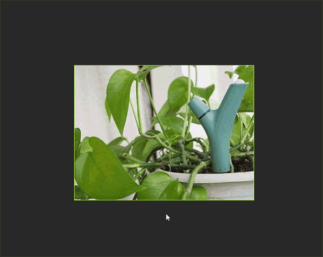
css
html, body {
margin: 0;
padding: 0;
background-color: #2c2c2c;
}
.wrapper {
position: absolute;
top: 0;
right: 0;
bottom: 0;
left: 0;
width: 400px;
height: 300px;
margin: auto;
border: 1px solid greenyellow;
transition: box-shadow linear .3s;
}
.wrapper:hover {
box-shadow: 0 0 10px greenyellow;
}
.wrapper .pic {
width: 100%;
height: 100%;
transition: transform linear .3s;
}
.wrapper:hover .pic {
transform: rotate(20deg);
box-shadow: 0 0 5px greenyellow;
}
.wrapper .line {
display: block;
position: absolute;
background-color: greenyellow;
opacity: 0;
}
.wrapper .line.top,
.wrapper .line.bottom {
width: 1px;
height: 0;
}
.wrapper .line.right,
.wrapper .line.left {
width: 0;
height: 1px;
}
.wrapper .line.top {
left: -1px;
top: -200px;
}
.wrapper .line.bottom {
right: -1px;
bottom: -200px;
}
.wrapper .line.right {
top: -1px;
right: -200px;
}
.wrapper .line.left {
bottom: -1px;
left: -200px;
}
.wrapper:hover .line.top {
animation: lineTop .3s;
}
.wrapper:hover .line.bottom {
animation: lineBottom .3s;
}
.wrapper:hover .line.right {
animation: lineRight .3s;
}
.wrapper:hover .line.left {
animation: lineleft .3s;
}
@keyframes lineTop {
from {
height: 0;
top: -200px;
opacity: 0;
}
to {
height: 100px;
top: 0;
opacity: 1;
}
}
@keyframes lineBottom {
from {
height: 0;
bottom: -200px;
opacity: 0;
}
to {
height: 100px;
bottom: 0;
opacity: 1;
}
}
@keyframes lineRight {
from {
width: 0;
right: -200px;
opacity: 0;
}
to {
width: 100px;
right: 0;
opacity: 1;
}
}
@keyframes lineleft {
from {
width: 0;
left: -200px;
opacity: 0;
}
to {
width: 100px;
left: 0;
opacity: 1;
}
}
html
<div class="wrapper">
<img class="pic" src="img/background.jpg" alt="">
<span class="line top"></span>
<span class="line right"></span>
<span class="line bottom"></span>
<span class="line left"></span>
</div>